“LIFE’S BETTER AT THE BEACH” PHOTO DAY WEEKEND IS IN MAY! CLICK HERE TO LEARN MORE!
Just for fun, I wanted to show a few images and talk a little bit about how they were made, post processing and what my thought process was in the creation of the image. I’m sure there are plenty of you out there that like to hear about these kind of specifics and some of you probably have no interest at all but just like seeing some nice portraits. Either way, it’s win-win! 🙂
PLEASE LEAVE ME A COMMENT AND TELL ME WHETHER OR NOT YOU LIKE THESE KINDS OF POSTS SO I CAN MAKE MORE OR NOT. ENJOY!
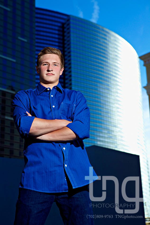
This senior portrait was taken on the top level of the Bellagio parking lot. Whenever I’m on the strip, I am always gazing upward at the tall buildings and I thought it would be fun to convey the same feeling with the senior. I glanced around and saw nowhere for him to stand so I had him stand on top of my car as I sat on the ground. The blue shirt, blue sky and reflections made for a great color harmony.
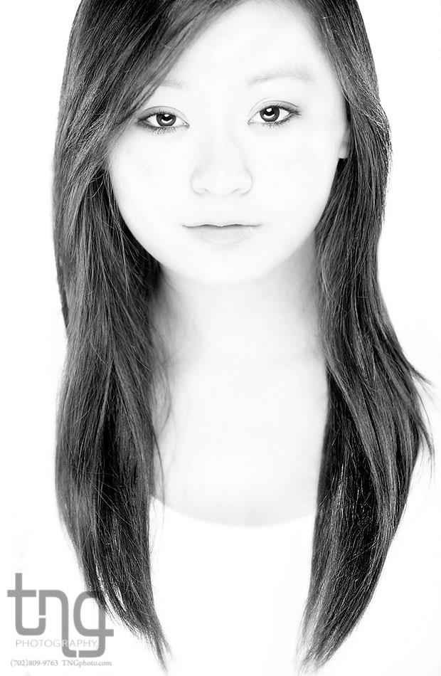
One thing I’ve become known for is my use of lighting and shadows to make extremely life-like, colorful and vibrant images that aren’t easy to replicate. Lighting is one of my favorite aspects of photography as every situation calls for a different type of lighting to be used. For this portrait, I wanted shadowless lighting and striking eyes on a high key background. Four lights were used. Two lights were placed about 135 degrees behind her on either side, skimming across her hair to bring out the texture in her dark hair. These two lights were relatively small because smaller lights are harsher and therefore can bring out more texture in dark hair–if she was a blonde I probably would have used larger, softer lights. There was also a light shining on my white background so that it would be completely white. For her face, I set up a strobe directly above her and placed my DIY large curved reflector directly beneath her. The strobe above her reflected off of this reflector which filled in any shadows that would be under her nose, lips, etc. The reflector is curved/arched shaped because I wanted it to reflect somewhat on the sides of her face and to add a unique catchlight on the lower hemispheres of her eyes (that’s not photoshop, just good ole photography!). The results were quite nice.
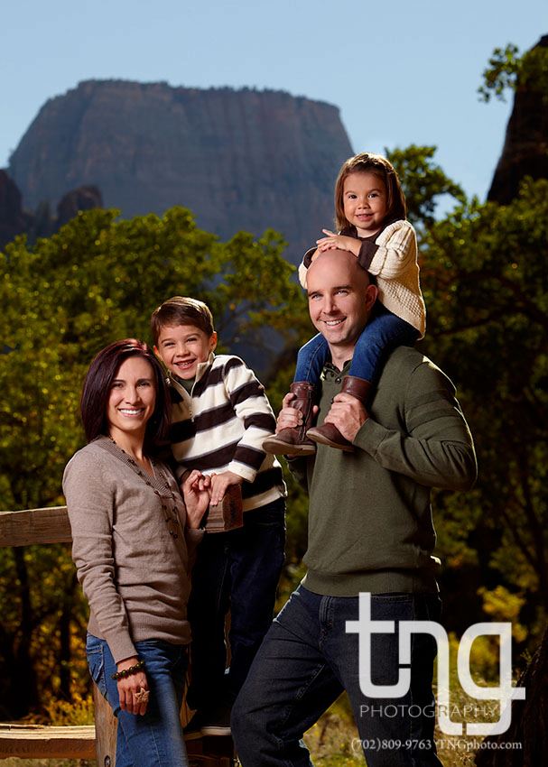
When it comes to family portraits, there are many rules I follow for myself to ensure a quality image. One of them being, if I were to remove every single person from the portrait except for one, would that person look good? If I took everyone out except this other person, would that person look good? In other words, everyone in the entire image MUST look fantastic! For this image, I was able to interact with the kids in a way that got them happy, relaxed and at ease with me–parents always seem to appreciate this– and I also was able to get a beautiful view in Zion canyon. I love being able to show off the scenery and location. As a finishing touch, I had the dad here hold his daughter on his shoulders. I did this for a few reasons:
- It kept the girl from running away and losing interest of the photos
- It helped the composition of the group. Notice how it is daughter with son and father with daughter. Also, their faces being where they are creates a diagonal in the image. Everything is vertical in the image–bodies, mountains, the low perspective– so the diagonal creates a contrast for your eyes.
- The sun was behind them and the dad has a shaved head. The little girl’s body blocked the sun from making his head glow.
STILL WITH ME? PHEW! THANK GOODNESS! I LOVE THIS STUFF AND COULD TALK ABOUT IT ALL DAY (BUT I WON’T)! THANK YOU FOR EVERYTHING!
If you haven’t taken the time to LIKE our Facebook page or follow us on Twitter, just click the links and you’ll get some fun updates from me!
Thanks!
Nate


Leave a Reply